
In our big data world, we have access to endless information—information with the power to help us find in-depth insights, start new conversations and tell better stories. But nobody wants to sit and comb through hundreds of data points to connect the dots.
If you communicate for a living, it’s up to you to help guide an audience through stories. One of the quickest and most effective ways to do this is through infographics. We’ve had maps since 8,000-plus years ago, charts since the 11th century and visual graphs since at least the 18th century, so the concept of infographics is nothing new. But they’re riding a modern wave of popularity. The key, for content marketers, is to create infographics that stand out from the crowd by correlating data points into effective storytelling rather than simple lists of stats.
Below are three examples of complex stories brought to life by putting data at the forefront.
1. Many parts, one whole
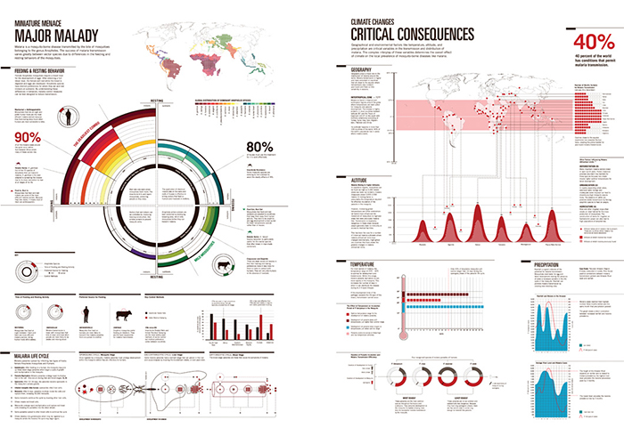
Through a combination of charts, maps and diagrams, this infographic from a University of Washington, Seattle, tells the story of the mosquito’s role in carrying and transmitting malaria. Focusing on the root of the disease helps guide decisions on how to best prevent and avoid the spread of this potentially deadly disease.
Data takes on many forms here. The piece opens with a visualization of the various feeding habits of the mosquito, transitions into a diagram depicting the life cycle of the disease and closes with a series of graphs highlighting different environmental factors contributing to the global spread of malaria. Each is supported with additional content to bring context and relevance to the data. Without that added content and context, the reader would be left to draw his or her own conclusions on what the data means. So, although each element could stand alone, the build from one to the next guides the reader through a complete—and clear—story.
2. The power of one visual
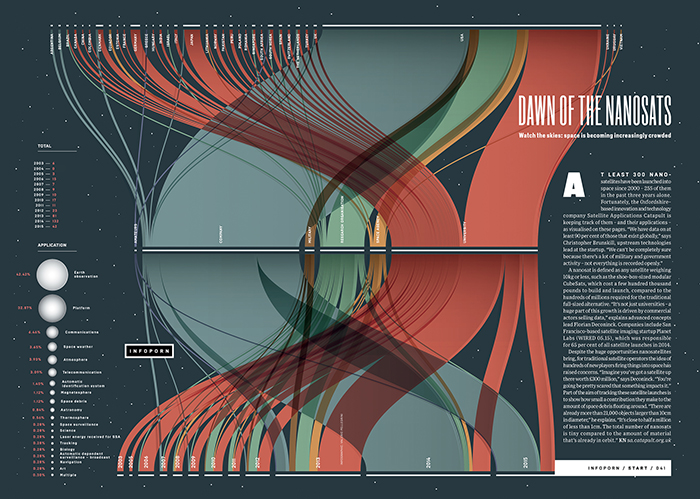
Sometimes it only takes one visual to say a thousand words. That’s the case with this Wired UK infographic about the growing number of nano-satellites entering the solar system. Choosing the right chart style can make or break an infographic, and this beautifully designed alluvial diagram encapsulates an entire story in one quick snapshot.
Melding large sets of data into one chart presents a challenge, especially if you want to avoid breaking the infographic into multiple pieces. In one unified image, this infographic not only highlights the increased number of satellites but also goes steps further by using color to categorize what industries are launching those satellites, then further breaks it down by county. It would have been just as accurate to present this data in a simple line chart, but adding more complex graphics tells a more complete and compelling story than just listing the facts. The viewer gets the whole story at a glance.
3. Connecting the dots for baseball fans
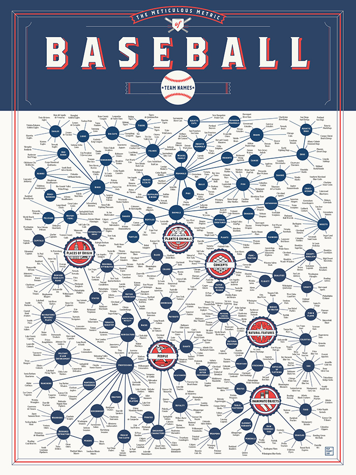
Data doesn’t always have to simply mean a bunch of numbers. Infographics can break down any set of information, including fascinating facts about pop culture or sports. This example categorizes nearly 600 names of baseball teams in different leagues to illustrate patterns.
This infographic truly connects the dots for the reader. I imagine this project started with just a long list of names (the data). But when analyzing the set and looking for trends or likeness in the names, patterns start to emerge. From those patterns, designers organized the data into categories and subcategories, using color and visual hierarchy to help the reader explore. At a glance, this infographic might seem overwhelming, but when you dive in, you can easily follow all the information and see how each team name tracks back to the larger category.